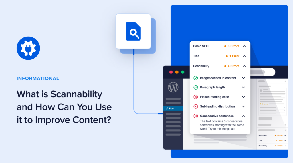
If you’ve been researching how to improve your content, you may have come across the idea of “scannability.”
Scannability is powerful enough to tip the balance from online failure to success.
In this article, you’ll learn about scannability and how to use it to achieve your website goals.
In This Article
What is Scannability?
Scannability is about making it easy for people to quickly read and understand your website or text. It’s like arranging things in a way that lets them easily skim through and get the main points without much effort.
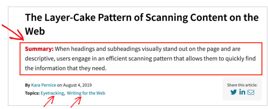
The term scannability became popular after a fascinating study was published by the Nielsen Norman Group in 1997.
Researcher Jakob Nielsen and his team sought to discover how users read on the web.
Their conclusion? “They don’t.”
“People rarely read Web pages word by word; instead, they scan the page, picking out individual words and sentences.”
Only a small minority of users in the study read pages word-for-word.
Subsequent research came to the same conclusion.
Making Pages Scannable
Nielsen’s team developed simple guidelines for making pages scannable.
The goal? Write to help people scan.
These guidelines include using short paragraphs, subheadings, and putting the most important information at the beginning of a page.
For a page to be scannable, the formatting must match how users read online.
In the years since the original study, scannability became a key feature of high-performing content.
Why Does Scannability Matter?
Scannability matters because it impacts engagement, conversions, and sales.
A user will decide whether to leave or stay on a web page within a few seconds.
A scannable page helps a user determine if the content meets his needs.
For these reasons, scannability is essential for successful content marketing.
When to Make Content Scannable
While scannability will improve most web content, there are some cases where it wouldn’t be appropriate.
For example, narrative nonfiction journalism or literature attracts users who want to read word-for-word. And putting the conclusion at the beginning of a novel wouldn’t make sense.
However, even some of this content may benefit from being formatted for easier screen reading.
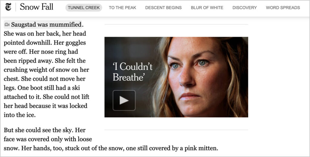
For example, editors of the captivating “Snow Fall” story broke up the long text with short chapter subheadings, video interviews with witnesses, animated graphics, and photos.
These orient and engage the reader.
How to Make Your Content Scannable
Follow these simple guidelines to make your web pages scannable.
Above-the-Fold Considerations
Above-the-fold refers to the portion of a web page that’s visible without scrolling down.
Most users will decide within seconds whether to stay on the page, leave, or click on a link. So, what’s at the top of a page matters.
- Inverted Pyramid: The Nielsen Norman Group (NN/g) recommends putting your conclusion and most important information at the beginning of your page.
- Key Links: Consider moving the page’s most important link(s) to the top. Keep those links to a minimum to avoid presenting too many options.
- Breadcrumbs: These tiny navigation links don’t take up much room. And they can entice readers who decide not to scroll further.
- Category Tags: Place these at the top to engage users who decide not to remain on the page.
The inverted pyramid approach is copied from news writing. Journalists often place the “5W and H” at the beginning: Who, What, How, When, Where, and Why. Details follow.
Below the Fold
- Subheadings: Break up walls of text with short, descriptive subheadings.
- Short paragraphs: Limit paragraph size to “one idea.”
- Lists: Vary your formatting by using numbered or bulleted lists where useful.
- Bolded text or Italics: Highlight keywords, but use this technique sparingly.
- Stylized Pull Quotes: With an eye-catching design, short pull quotes can boost scannability. Consider highlighting what’s unusual or surprising.
- Highlight ‘Asides’: Consider visually highlighting sidebar text to differentiate it from the main flow of the article.
- Images and Screengrabs: These can be useful for breaking up long stretches of text, but images should only be used if they are helpful to the reader. Be cautious when using decorative images.
- Visual Data Representation: Where helpful to the reader, present data visually in charts, tables, or interactive data embeds.
Improve Scannability With All in One SEO (AIOSEO)
To put these ideas into practice, we recommend using All in One SEO (AIOSEO).
The plugin analyzes your pages for readability and scannability in addition to SEO. These readability and SEO checks include instructions on what to change.
Here’s how the readability feature works. AIOSEO checks:
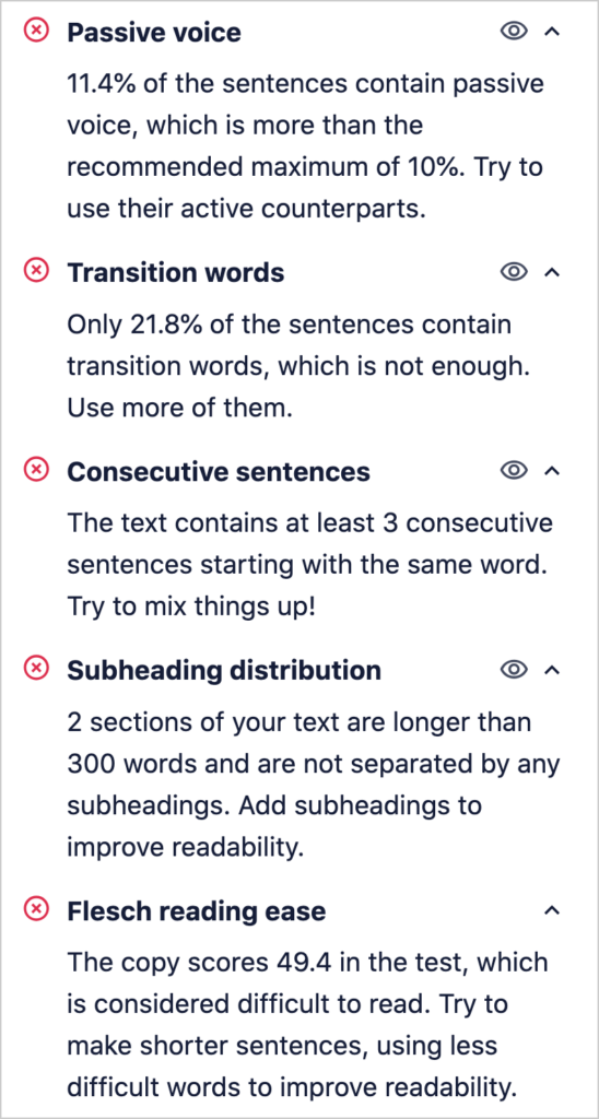
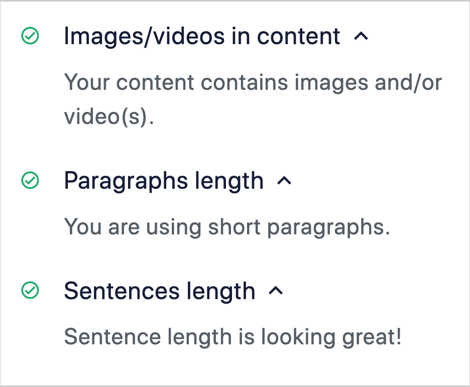
- Paragraph length: The target is no more than 120 words per paragraph. Longer passages are difficult for users to read on screens.
- Images/videos in content: If there are none, you’ll be encouraged to add relevant media.
- Sentence length: AIOSEO checks for excessive sentence length. The target word count is 20.
- Subheading distribution: The plugin checks to ensure you’re breaking up content with subheadings. It will suggest adding subheads to passages longer than 300 words.
- Flesch Reading Ease: The plugin uses the Flesch-Kincaid readability tests to assess how easy it is to read your content. You’ll see recommended improvements.
Once you’ve installed the All in One SEO (AIOSEO) plugin, log in to any WordPress page to get these recommendations.
Your All in One SEO tools will appear to the right of your article.
Click on Readability, and you’ll get suggestions for improvement.
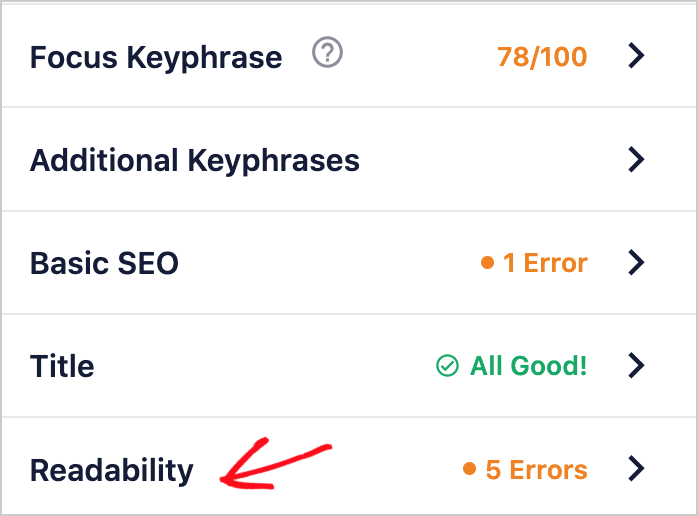
Here are some examples.
You’ll also see what doesn’t need improvement.
All in One SEO is an established plugin with thousands of 5-star ratings on WordPress.org. Over 3 million people are using the plugin.
Pricing starts at $49.50/year.
Moving Forward With Scannability
Research shows that when you write with scannability in mind, your content will be easier for users to consume.
Good formatting allows for more white space around page elements, and this is easier on the reader’s eye.
These principles work not only for desktop or mobile screen apps but also for user interfaces and web design overall.
Curious readers may want to delve into the Nielsen Norman Group’s eye-tracking studies and research into reading/scanning patterns, such as the f-pattern.
You’ll find valuable insights to apply to your website and content.
The Nielsen Norman Group is considered one of the world’s premier user experience (UX) design consultancies. Their blog highlights findings and applications of their usability testing and user research.
Bonus Tip: Lead Capture
Scannable content will engage more readers, but you’ll still have some who want to leave quickly. This is where an exit-intent pop-up is useful.
These pop-ups will appear when people are leaving your site.
We use the OptinMonster plugin for our exit-intent pop-ups and found it to be a reliable way to boost conversions and revenue.
You’ll get a beginner-friendly way to create pro-looking call-to-action designs. And the plugin is low-cost.
Browse this gallery of examples and check out the results from users.
Breadcrumbs: You can add breadcrumbs with a click of a button with the All in One SEO (AIOSEO) plugin.
What’s Next?
We hope this article has helped you understand what scannability is and how you can use it to create better content.
You may also want to check out other articles on our blog, like our copywriting tips and tutorial on writing meta-descriptions for SEO.
If you found this article helpful, then please subscribe to our YouTube Channel, where we publish new tutorials weekly. And join us on X (Twitter), LinkedIn, or Facebook to stay in the loop.
Disclosure: Our content is reader-supported. This means if you click on some of our links, then we may earn a commission. We only recommend products that we believe will add value to our readers.
